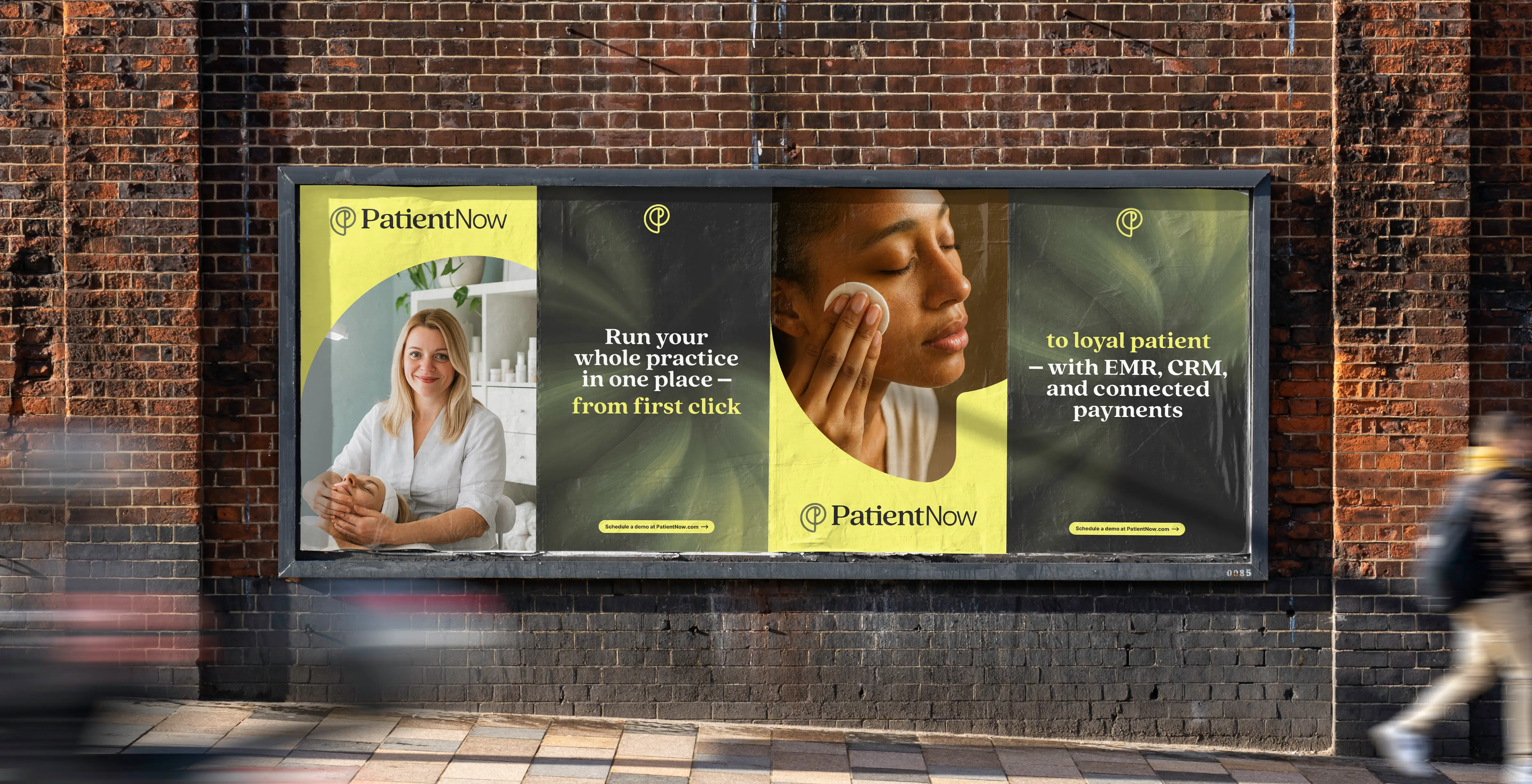
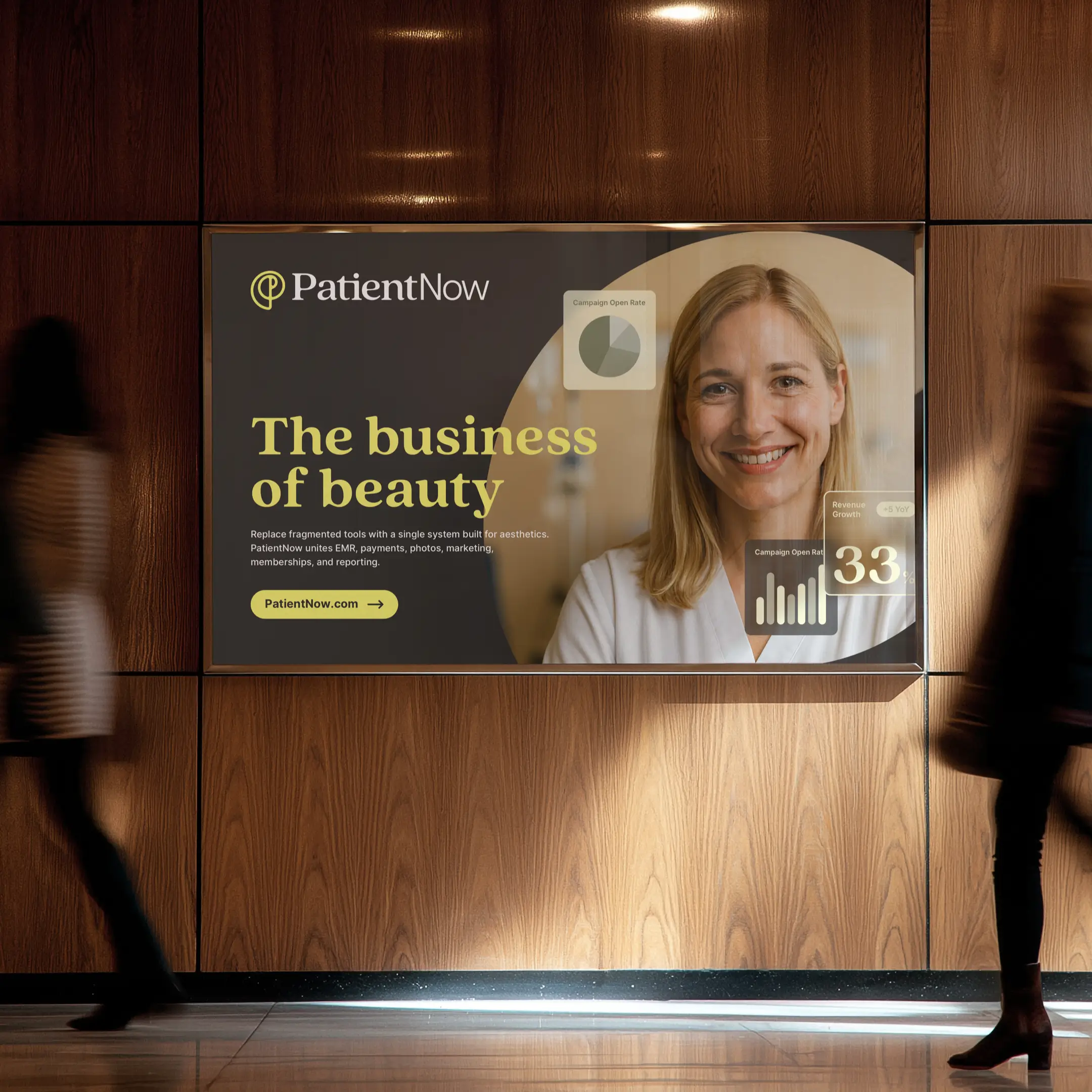
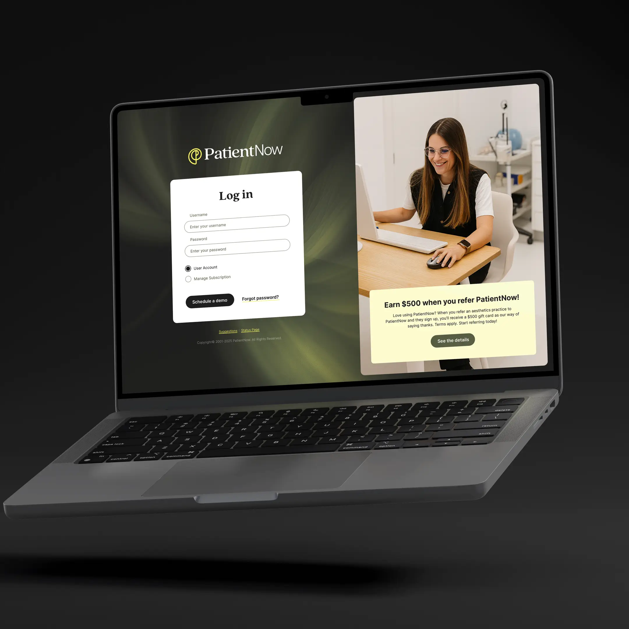
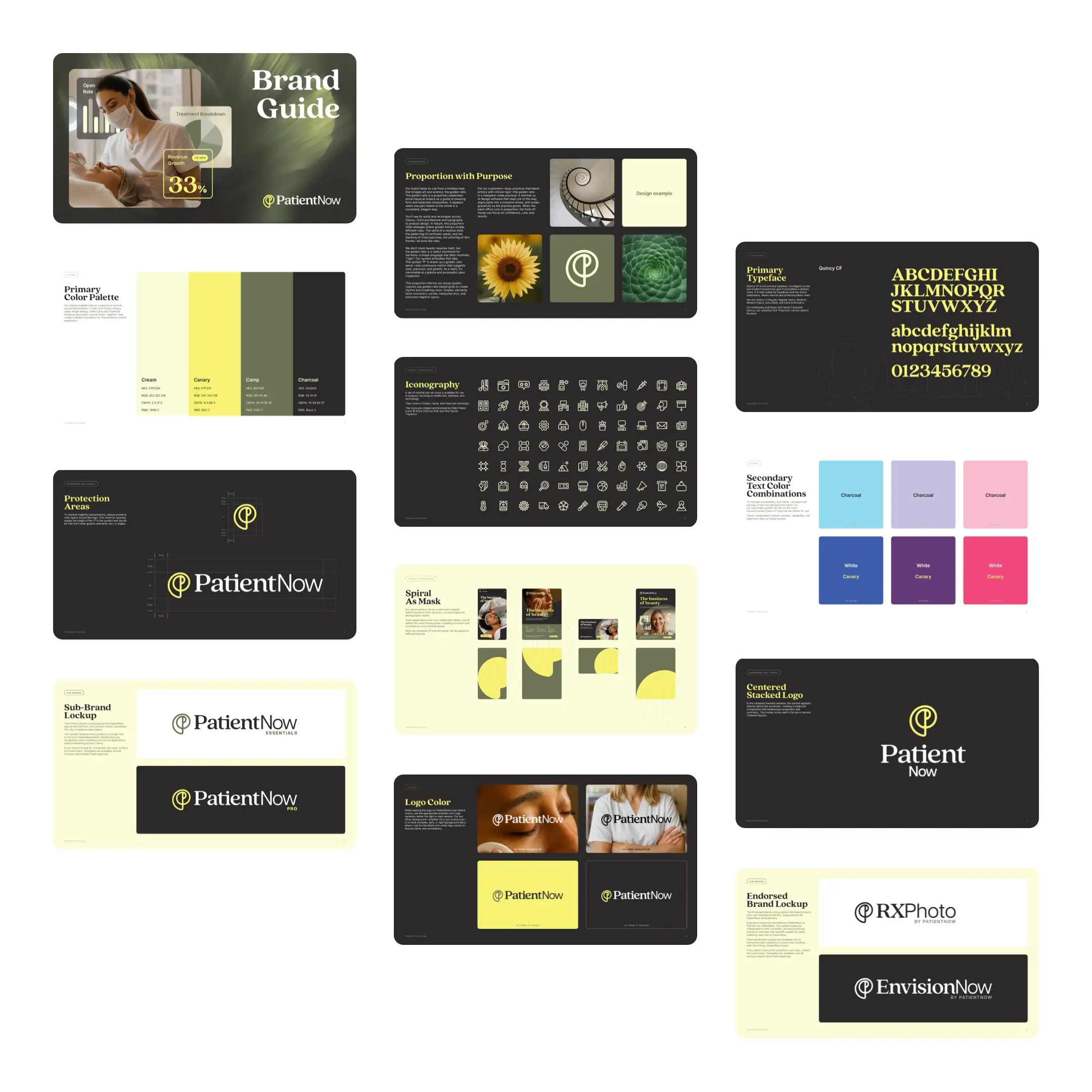
A confident brand, shaped by natural proportion
I led a full-scale rebrand and redesign for PatientNow—new logo, fonts, colors, and a refreshed visual identity applied across web and marketing. The system is anchored by a spiral mark I designed as a modern interpretation of the golden ratio. It nods to the beauty of nature—and by extension, the kind of natural results PatientNow’s customers seek. That simple, memorable form became the organizing idea for layout, motion, and graphic elements.


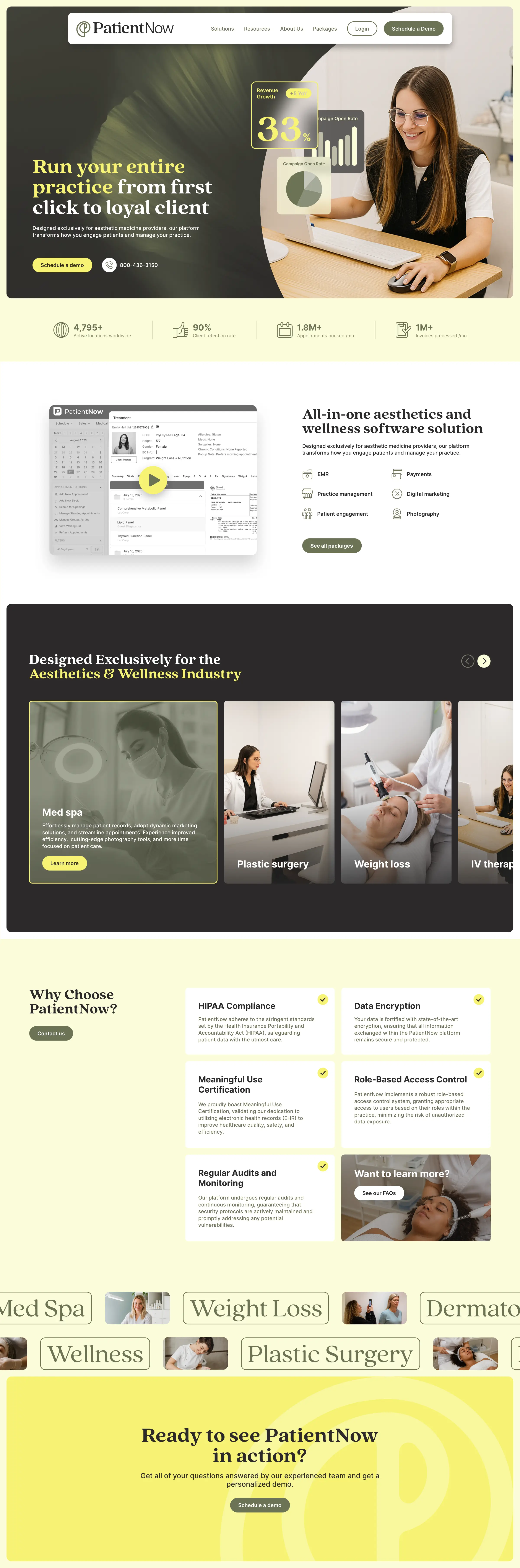


From identity to interface
My brief focused on redesigning the high-traffic website pages so the team could scale quickly: the homepage, feature pages, and pricing/packages. Each template balances clear product storytelling with human proof—bringing the brand to life while making it easier for prospects to understand what PatientNow does at a glance.