An identity engineered to reflect scientific precision at Overt

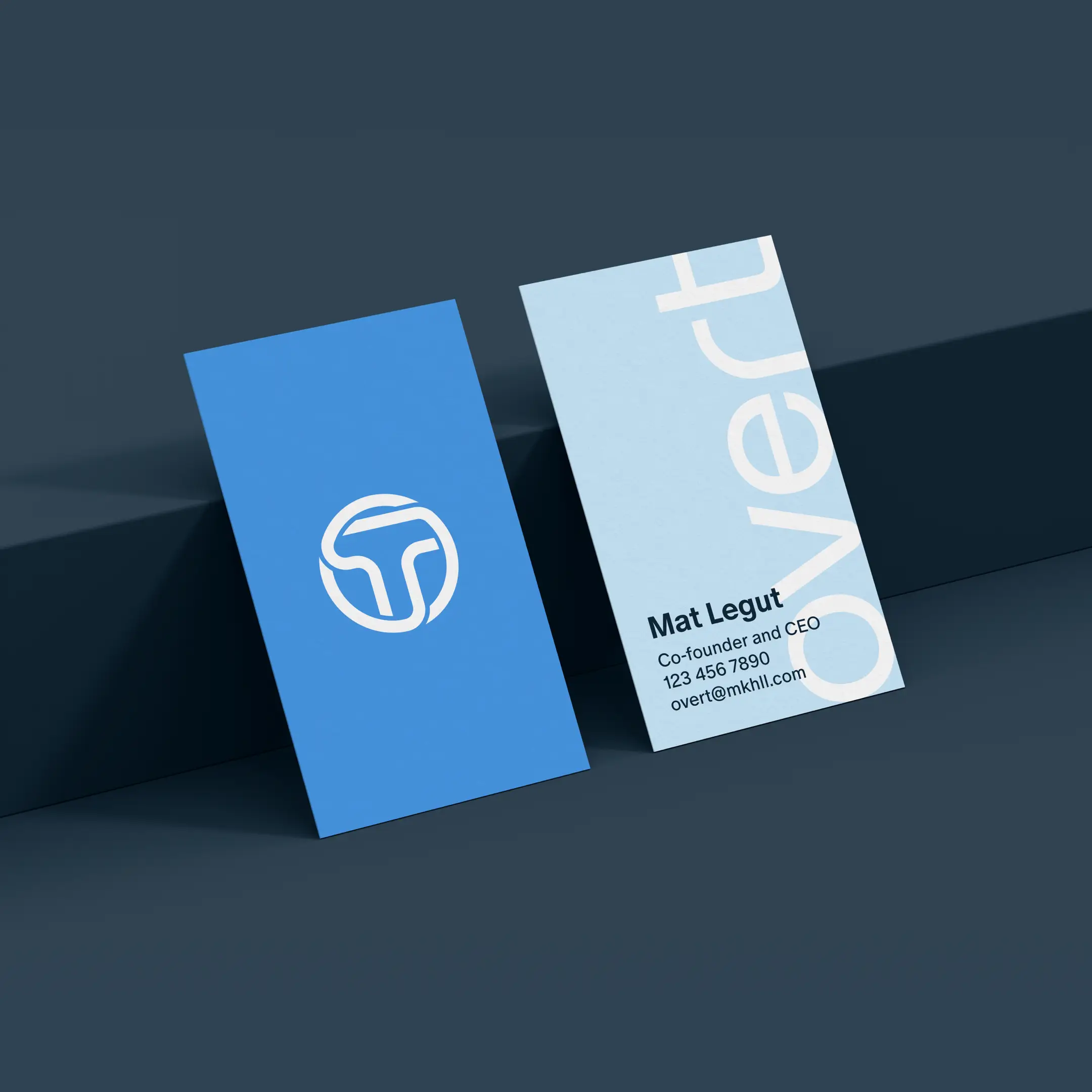
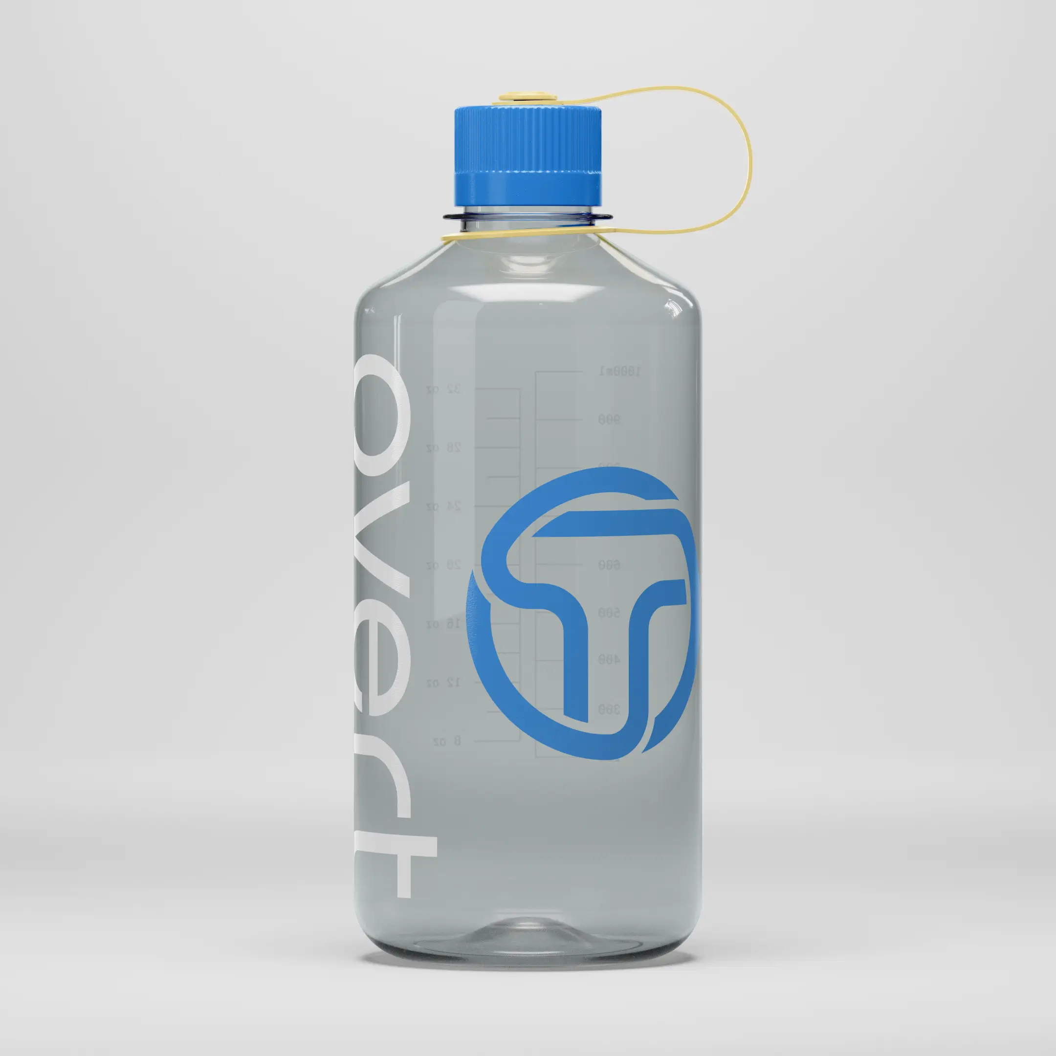
The Overt team tasked me with creating an identity that could support their new website and help tell a credible story about their work at the cutting edge of cancer research. I designed a sleek, modern logo anchored by an interlocking “O” and “T” symbol – reflecting the lock and key engineering of receptor design through a simple visual metaphor.

The Overt logo surrounded by plotted AI data
A mockup of the Overt brand applied to business cards
A 3D interpretation of the Overt logo, showcasing the interlocking 'O' and 'T' shapes

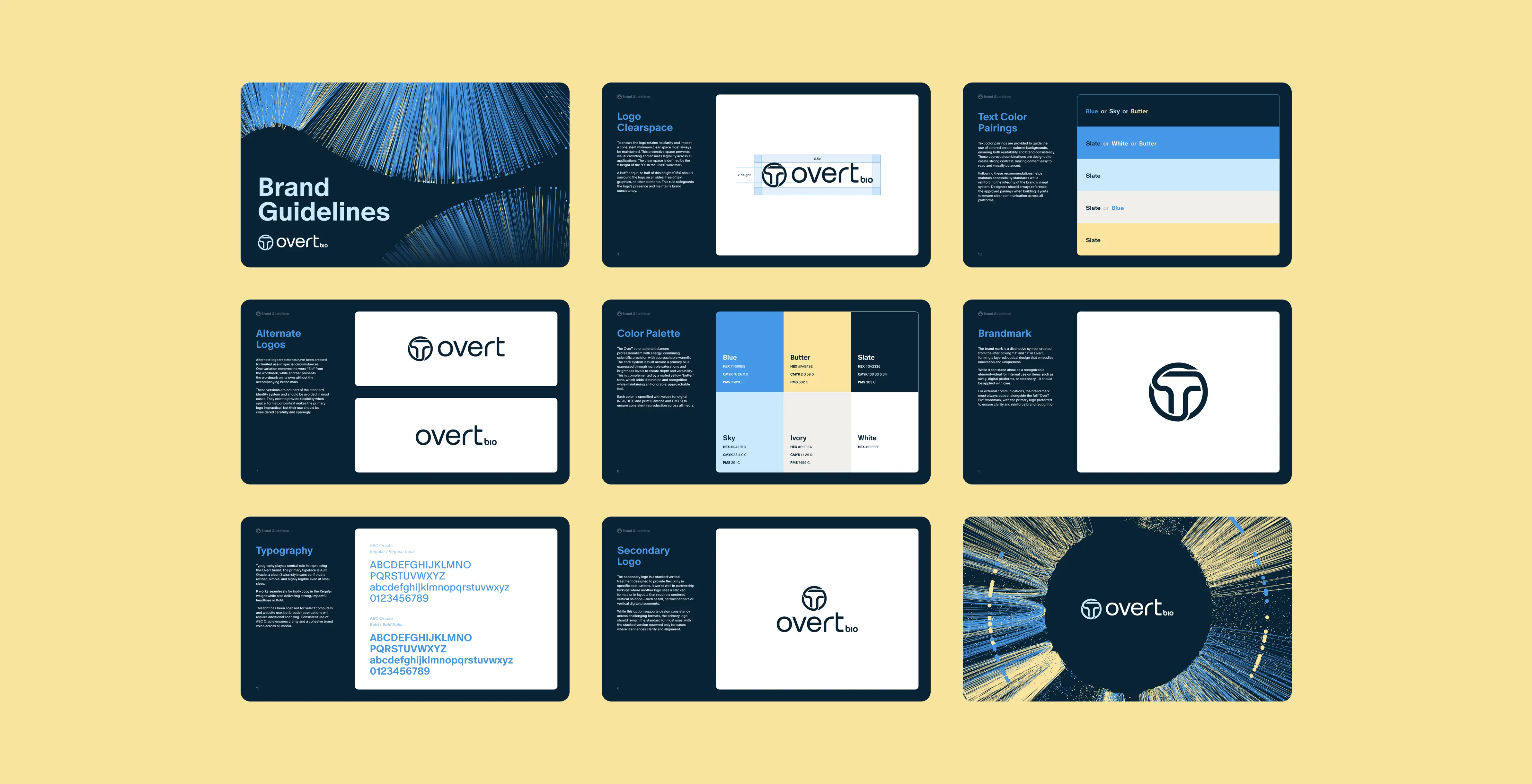
From data to design: the web experience

On the website, I implemented the new typography, color palette, and symbol alongside a signature data visualization motif. Referencing the AI-driven analysis the team uses internally, these visuals translate complex datasets into a textural layer that animates and morphs across the website. The data and scientific rigor of Overt becomes the central asset of the brand.

A snapshot of the Overt website homepage

Ready to ship: assets, logo pack, and rollout

I designed a blueprint-style isometric illustration system to explain Overt’s core tech—precise and dimensional yet approachable—and mocked up hats, bottles, and team gear to show how the identity could translate to swag for the team. For the rollout, I delivered a full logo pack (lockups, scales, variants) and a concise brand-guidelines PDF covering color, type, layout, motion, and applications.

Four icons showcase the Overt illustration direction
A mockup shows the Overt brand applied to a drink bottle
A thumbnail view showing 9 pages from the Overt brand guidelines document
The Overt logo in its stacked format
The Overt logo in its horizontal format with 'bio' appended to the end