Breathing you can see: a living identity for BreatheLabs
I was tasked with creating a brand from the ground up for a new company focused on lung health. The brief centered on the science of breathing, calling for something light, airy, and approachable. The solution is a flowing 'b' mark— whose curves mirror the rhythm of an inhale and exhale. This mark is paired with calm palette and flowing gradients that communicate a sense of ease.


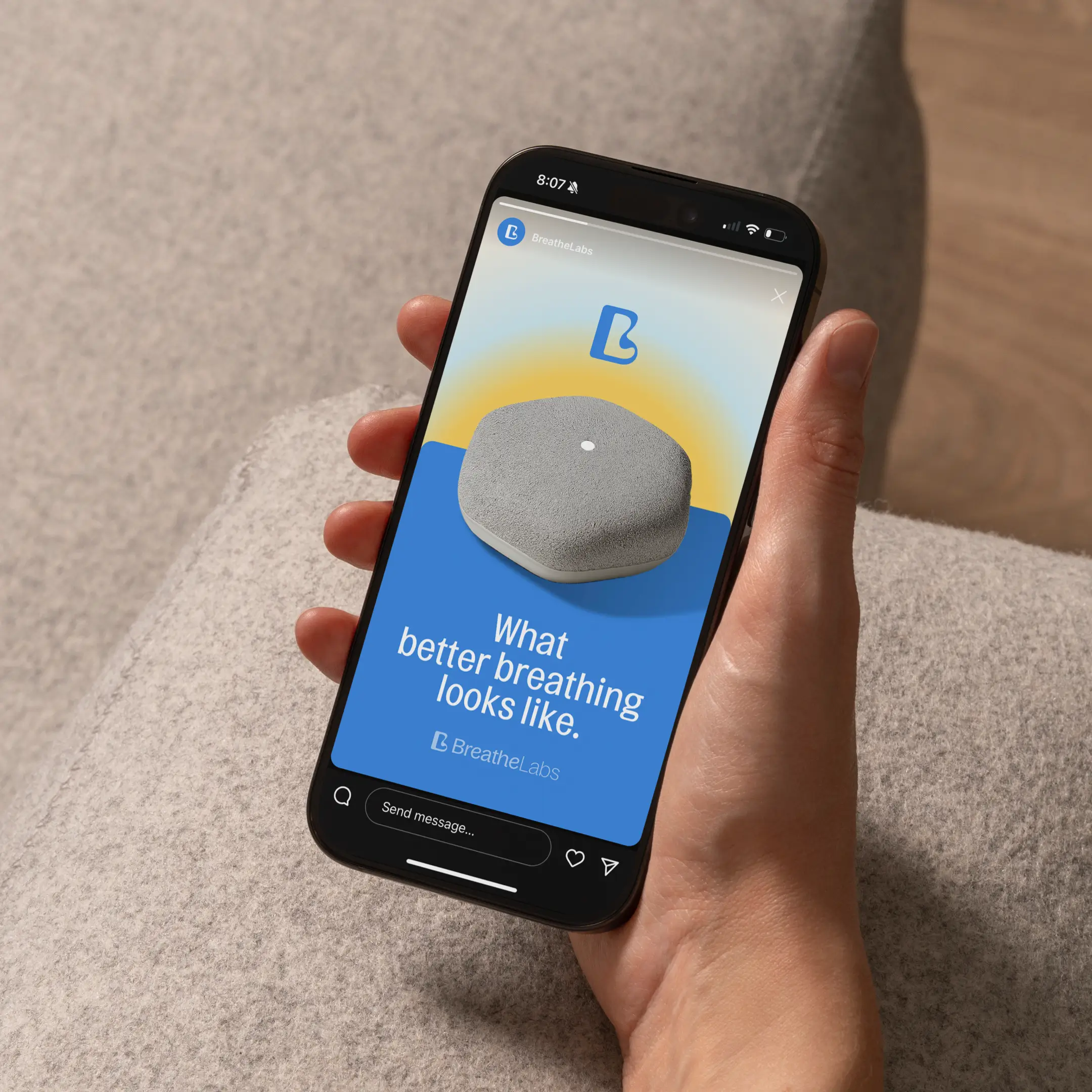


Speculative applications to prove the system
The visuals on this page are concept mockups I created during exploration to test color, typography, and voice in context. Packaging studies use an embossed treatment that echoes the flowing “b,” while a gentle gradient palette shifts like a slow breath. In ring-like compositions, the gradient reads as a full breath cycle; in broader fields, it recalls an open sky—air, space, clarity. These speculative layouts helped validate the system’s feel before any formal rollout.